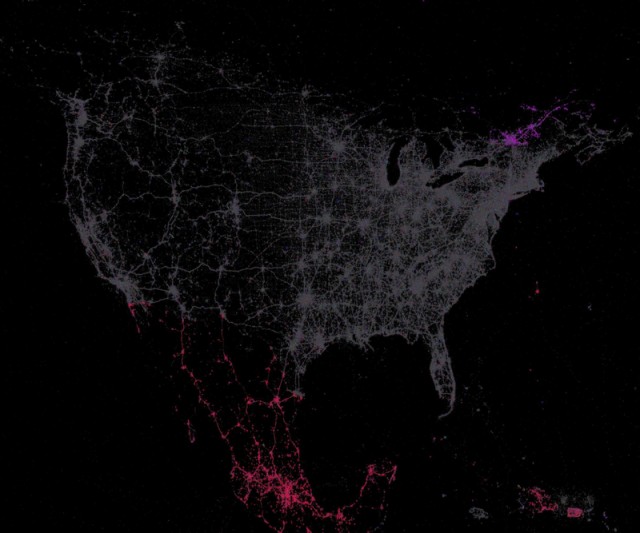
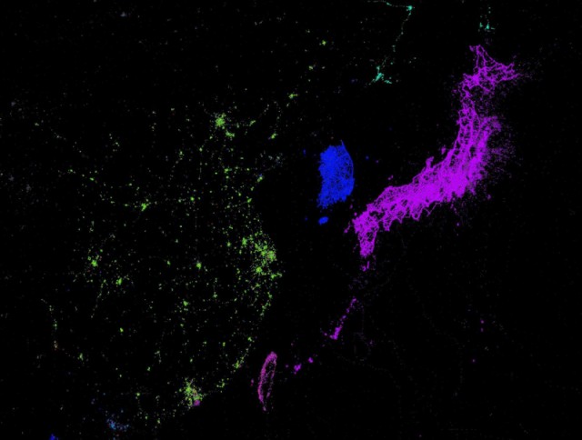
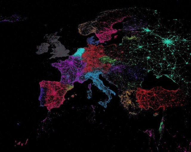
Data Visualisation. Which language do you browse?
Google Chrome’s translate feature allowed cartographer Eric Fisher to read the language used by the browser. Combining this information with Twitter’s API he created a beautiful global map of languages, emulating countries’ shapes, while at the same time showing how they fuse together at their borders.
See a full scale version here and follow creator and self-proclaimed historian of misspelt street signs Eric Fisher on Twitter.
There is another beautiful visualisation of Twitter @-replies here.
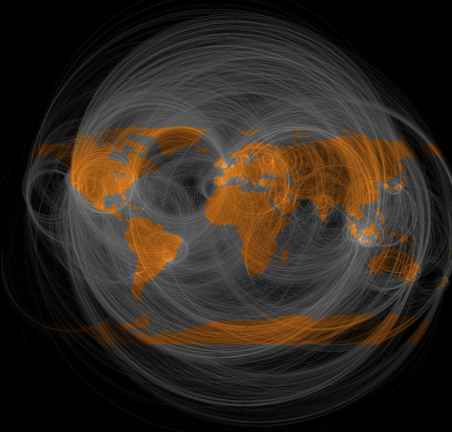
Twitter @replies