Very creative, but I prefer luxury lifestyle advertising when it comes to alcohol.
Posted by: David Isserman at November 14, 2007 04:47 PM
--------------------------------------
The concept of promoting "W" is cool, especially for me as a Polish person. The production is too pesimistic. I prefer "Smirnoff Raw Tea" viral as a better way to promote W(V)odka.
Posted by: Greg Albrecht at November 14, 2007 08:35 PM
--------------------------------------
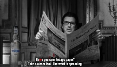
A spelling error in the first jpeg. Ugh. So slack, especially from W+K, a well-respected agency. I checked the site, it's definitely there.
Dear W+K: It's *today's newspaper*. Now, where do I send my invoice for proofreading?
Posted by: purplesimon at November 15, 2007 04:36 PM
--------------------------------------
What an interesting point about the similarities between the Wodka and the Fifa ads.
While creatives rave about what "inspires" them, it seems that often times we are merely "inspiring" one another to create replicates of artwork already produced.
Where do we draw the line between "inspiration" and "duplication" in advertising? How much ?originality? actually exists anymore?
Great observation!
Posted by: Holly Jones at November 19, 2007 08:22 AM
--------------------------------------
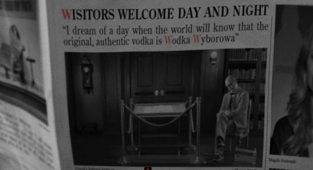
Great online campaign indeed, I borrowed it for my blog (with credits to your find, of course).
However, let me just bring to your attention that the menu is not copied nor borrowed from Fifa 08, who themselves really invented nothing.
This sort of typography arrangement is directly inspired of 1930's Bauhaus movement, which ran largely in Poland. And if there's anything, it is way better implemented than the real poor type application of the Fifa menu.
You can't copy a design movement, you only borrow from it, and if you do so - better do it in respect to its quality.
Posted by: AdKrispies at November 21, 2007 02:09 PM
--------------------------------------
|