|
April 19, 2010
|
 |
| Easyjet, ecommerce and Facebook |
Marketing on Facebook is continuously evolving, while getting people's attention is getting more and more difficult. The coolness of the brand isn't a good reason for keeping its status updates in someone's timeline. So the same basic process applies in order to gain fans and keep them loyal. Once again, it's all about being valuable, providing good, amusing or best of all, useful content.
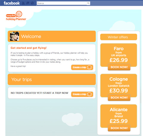
Easyjet has recently launched an Holiday Planner within its Facebook fan page. It's an application that allows fans (yep, you need to become a fan in order to be able to use it...) to plan holidays together with their friends. And very soon they are going to add a feature that will allow people to buy plane tickets directly from the social network, without having to visit the Easyjet website.
This is going to be a huge shift. We are starting to get used to give up our brand websites to let interactions with the our brand to happen mostly on social media... but ecommerce... that's another story. As a marketer, I don't know if I'm ready for this. Interactions and relationships on Facebook are so volatile. Also, trust is so difficult to get. I appreciate it's important to provide consumers with options but I can't imagine the death of the website to be too close.
|
|
|
|
|
|
|
April 06, 2010
|
|
| Gap + iPad = cool |
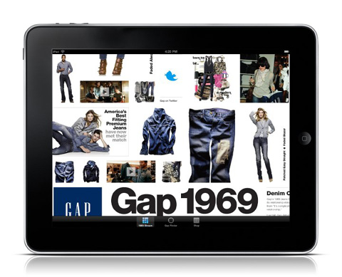
As a consumer based in Europe (and partly as a digital marketer), I never thought Gap was a cool brand. But now, a few days after the iPad has been launched, I definitely changed my mind.
The Gap 1969 Stream iPad app is so much of the moment! It's an iPad application that allows you to browse a lot of (branded) denim content, celebrities and designers videos as well as music. And on top of this, looks like you can also purchase products directly from the application. Once again, the geek marketer in me claims an iPad as soon as possible. But I guess I will have to wait until end of April to get one in Italy.
|
|
|
|
|
|
|
March 29, 2010
|
|
| God save the brand (experience) |
I apologise. With World Cup just 2 months ahead, my time for blogging is almost non-existent. I feel bad for not taking care of Adverblog, but it's worse is that I don't even find the time to browse around and check the links I receive for my own interest and education.
Today I've been lucky, on a friends' website I found a very good collection of links to a selection of 25 great ecommerce website designs. The selection is a good starting point to discuss how an ecommerce homepage should be.
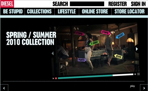
A lot of people think that if you give too much space to the brand experience, than consumers will not understand that is a retail experience. Others argue, that if you manage to "sell" the brand experience well, than consumers will also buy the product. Because of my background, I tend to agree with the latter opinion. However, a few recent experiences actually proved me that more product less brand is better if your focus on ROI. Nevertheless, I finish my confusing post by sharing a link to a brilliant ecommerce enable brand video by Diesel.
God save the brand!
|
|
|
|
|
|
|
|
|
|
|
January 20, 2010
|
|
| Fashion for dogs and ecommerce dogs (owners) |
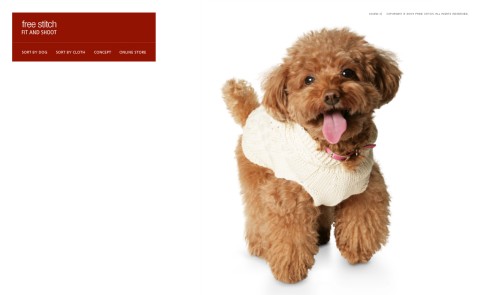
From Japan another great example of digital communication and a clear demonstration that the online media and online commerce are (more than) ready to support any brand or product (if the communication is done in the right way). Today we talk about dogs, fashion and ecommerce. The brand is called Free Stitch and produces clothing for small dogs. I personally hate the idea of putting a ridiculous cloth on my dog but I appreciate small dogs might suffer cold... and this website would definitely push me to buy something fashionable.
The experience is brilliant, with a gallery of "models" wearing the different items and the absolutely fantastic possibility to browse the collection by clothing or by "dog".
Continue reading... "Fashion for dogs and ecommerce dogs (owners)"
|
|
|
|
|
|
|
December 26, 2009
|
|
| Dear Santa, give me a discount |
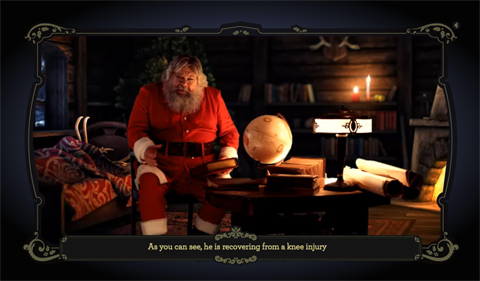
Given the Holiday period is almost mandatory to post about Santa Claus and possibly from one of the countries where he possibly is from. So today we travel to Latvia, to discover a promotional website launched by Air Baltic to give away discounts in a nice way.
Visitors meet Santa Claus, have a quick talk with him, and are offered a 30 percent discount on their next flight with Air Baltic. The experience isn't particularly innovative but it's still nice and makes sense at this time of the year.
Continue reading... "Dear Santa, give me a discount"
|
|
|
|
|
|
|
November 18, 2009
|
|
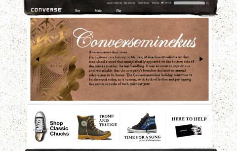
| Converse: buy, make play |
Converse has recently launched a new brand website with ecommerce fully "embedded" in the experience. Navigation it's pretty straightforward: buy, make or play. The first option is to buy in-line product, the second is to customise your shoes and the third is to be (slightly) entertained by the brand.
Continue reading... "Converse: buy, make play"
|
|
|
|
|
|
|
November 05, 2009
|
|
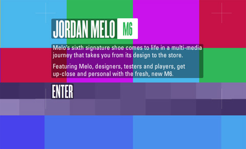
| Jordan M6 video experience |
I love the multimedia journey that my colleagues and Nike/Jordan created for the launch of the M6 model. I like it because it has a rather fresh approach with video product storytelling divided in small but effective pills.
It's a walk through the inspiration, the design process and Carmelo Anthony's feedback to the product. Very insightful and very "intimate" and therefore pretty authentic.
Continue reading... "Jordan M6 video experience"
|
|
|
|
|
|
|
August 23, 2009
|
|
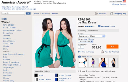
| American Apparel: ecommerce meets Youtube |
American Apparel has launched "Le Sac Dress". A drape dress with long, versatile straps you can wear in twelve different ways.
Yep, it sounds a bit complicated, but don't worry, it comes with twelve videos posted on Youtube that teach you how to wear it.
Video instructions, a smart simple way to enhance the online commerce experience, especially for those goods which generates doubts in potential buyers.
|
|
|
|
|
|
|
July 16, 2009
|
|
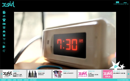
| X-Girl: an example to follow |
From Japan, a new fashion website I like for the good mix of brand and ecommerce experience. X-girl is teenagers brand with a pretty wide and colorful collection which cannot afford to communicate in a boring way to its consumers and, at the same time, needs to think about ROI.
The Xgirl website first of all features a great interface, which really shows you the effort they put in making the experience entertaining, interesting and last but not least usable. Even if everything is in Flash you never feel lost in the navigation which is, weird but true, quite uncommon in ecommerce enabled Flash websites.
Continue reading... "X-Girl: an example to follow"
|
|
|
|
|
|
|
June 10, 2009
|
|
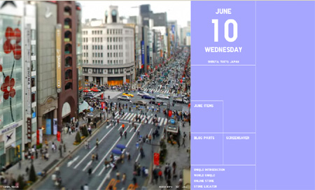
| The Uniqlo calendar |
Another interesting online project from Uniqlo. After "the clock" and "the map", it's time for "the calendar".
The website at the moment is pretty basic: landscapes across Japan are featured with tilt-shift style photos. If you click on the photo it becomes a mosaic, and you can discover an Uniqlo item that matches the color of the tile. As usual (at least for the Japanese brand) e-commerce is then just one click away.
Continue reading... "The Uniqlo calendar"
|
|
|
|
|
|
|
April 27, 2009
|
|
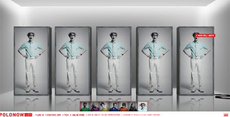
| Uniqlo Polo Now |
From Japan, a new interesting project by Uniqlo. How to make a polo collection cool just playing with some good photos and a great sound design.
And e-commerce store, as usual, is just one click away.
Continue reading... "Uniqlo Polo Now"
|
|
|
|
|
|
|
April 19, 2009
|
|
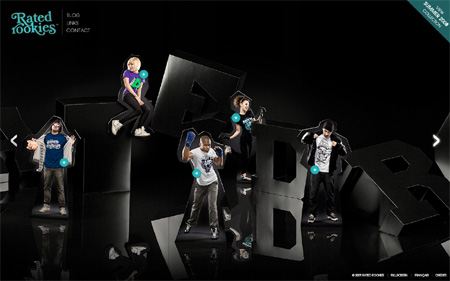
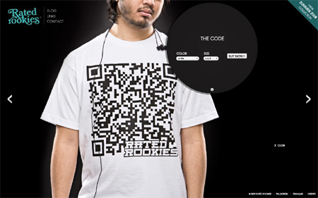
| Rated Rookies clicks! |
Selling t-shirts online is getting harder and harder because of the growing competition. T-shirt artworks matter (of course!) but you need a further push to succeed. Being able to generate word of mouth is the first element that comes into my mind. But the key is to have a good website where the click&buy; button is right there where it can trigger consumers' compulsory shopping instinct.
Check out the Rated Rookies website. It's a t-shirt collection showcase, nothing more but the point is that everything is simple and nicely done.
|
|
|
|
|
|
|
April 15, 2009
|
|
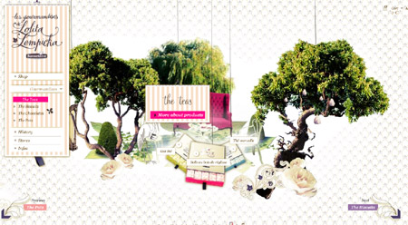
| Delicious Lolita |
Shopping online for food has never been so cool (and even sexy). Check out the website of Les Gourmandises de Lolita Lempicka where food photographs, illustrations and animations mix in a sweet and engaging way.
Food prices are also for "amateurs", but if the chocolate and the cookies are good as their packaging and presentation, maybe it's really worth spending 8€ for a small box of petit beurre :-)
Continue reading... "Delicious Lolita"
|
|
|
|
|
|
|
|
|
|
April 14, 2009
|
|
Surf with O'Neill
|
|
|
|
|
|
March 21, 2009
|
|
Drag & drop shopping
|
|
|
|
|
|
March 12, 2009
|
|
The dancing t-shirts
|
|
|
|
|
|
March 08, 2009
|
|
Uniqlo Barbie style
|
|
|
|
|
|
|
|
Home shopping according to H&M;
|
|
|
|
|
|
|
|
New look for K-Swiss
|
|
|
|
|
|
February 02, 2009
|
|
The Playground Barometer
|
|
|
|
|
|
February 01, 2009
|
|
Closed Jeans is open to celebrities
|
|
|
|
|
|
January 27, 2009
|
|
Play(with)Muji and buy
|
|
|
|
|
|
December 16, 2008
|
|
Scary inspirations on NIKEiD
|
|
|
|
|
|
December 12, 2008
|
|
Goldenhook : choose your grandma
|
|
|
|
|
|
December 08, 2008
|
|
Fiat 500 by Diesel
|
|
|
|
|
|
September 24, 2008
|
|
United Colors of Uniqlo
|
|
|
|
|
|
August 13, 2008
|
|
Some freshness in online fashion
|
|
|
|
|
|
|
|
A splash into Crumpler's world
|
|
|
|
|
Are looking for more cool interactive ideas? Check the archives
|
|
|
|