Digital advertising and marketing: only the best ideas worldwide, since 2003
Tag archives: data visualisation
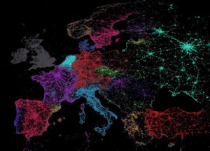
Data Visualisation. Which language do you browse?
Google Chrome’s translate feature allowed cartographer Eric Fisher to read the language used by the browser. Combining this information with Twitter’s API he created a beautiful global map of languages, emulating countries’ shapes, while at the same time showing how they fuse together at their borders.
Popular posts
Tags
adidas advergame advergames advertainment advertising ambient marketing australia belgium best brazil coca-cola email marketing facebook fashion france germany google heineken ikea infographic italy japan marketing mobile content mobile marketing msn nike nokia online ads online advertising online campaign online marketing print advertising rich media samsung sms spain sweden tvc twitter uk video of the day viral marketing volkswagen wieden + kennedy
