Levi’s Cut to Reveal You
I know from experience how difficult it is to always come up with new visual ideas to present a denim collection. Levi’s did an interesting job with its latest Cut to reveal you website developed to present female Spring Summer Collection.
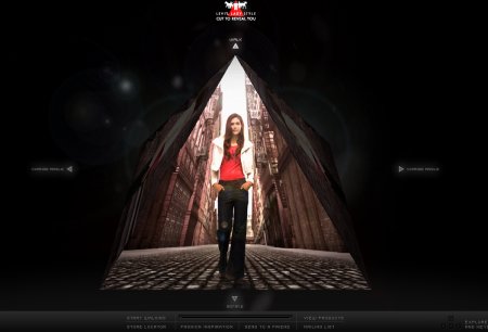
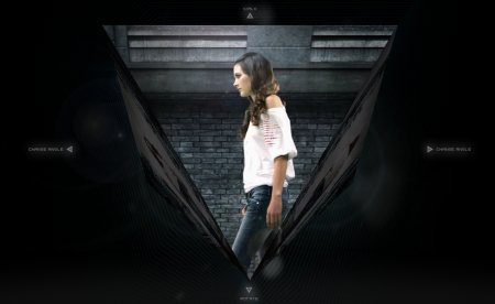
The innovative navigation system allows you to see the denim from four different points of view (front/back/left/right), plus you can see the fitting on the model while she walks. You can move around the screen using either the mouse or the keyboard and access a special area to zoom into the product details.
The “walk” functionality is very original but to me it doesn’t deliver its coolness because of the reduced frame window in which it is placed. Also, despite the enhanced used of video, I’m not sure that, in the end, the product comes out so well. The browsing experience is not so smooth, even with a fast connection there are several moments in which you sit and wait while the site loads. Waiting is not a big deal if content is good, but here I feel that it affects the flow of the experience reducing the navigation to a series of steps instead of presenting a smooth path. And I think there are only 2 models to discover.
The agency behind the project is Ogilvy One Singapore.
No matter how good (or bad) a site is, it’s worthless if you have to stare at your screen for minute after minute waiting for the thing to load. Funny how so many designers forget that not so unimportant detail.
That’s right. It’s annoying to wait for those sites to load but I think this one is worth waiting for anyway.
it’s just like the Y3 website from a few years back
How amny times do we have to look at inane sites like this, wow a pyramid …thats rotates …then shows video no way …Id rather watch the originals in Giza getting built
CAN WE PLEASE START FOCUSING ON IDEAS NOT navigation GIMMICKS …this was obviously done by a ‘cool factor’ before function type studio…
so so so sad and laughable all at once …
ideas first creative second
And…it is quite similar to the new Diesel e-site. It feels like they had to fill the gap somehow.
The whole thing loaded in about 10 seconds for me, and I had no gaps or stutters. The user experience was quite smooth. Maybe they were experiencing very heavy traffic due to all the users you were driving to their site (go ahead, take the credit).
That voiceover is terrible, completely cheesy monologue. Much improved with the sound turned off.
The visual experience was interesting. The idea with the triangle, that some people here seemed to miss, was the correlation to the shape of the cut of the jeans to the body shape of the woman. When the triangle is small at the bottom, they are showing tapered cut jeans, fitted at the ankle. When it has the wide end of the triangle at the bottom, it is showing flared jeans (more boot-cut/bell-bottom style). The premise of the site is meant to be different cuts that accentuate the body shapes of different women.
I’m in total disagreement with most here. I don’t think it was a visual gimmick with no idea, I think it was a good idea, with an OK, but not great, execution… basically done pretty well, but a good designer working with a mediocre copywriter. Definitely improved by turning the sound off.