Love and Hate Relationship
This site is soooo cool but so hard to love. It’s for the X Games. The graphics and use of video and design are so lovely but the navigation is absolutely the worst. I really like what they do with the design when it expands and reveals such cool graphics but I really got annoyed while trying to nav between the sections at the upper level. Maybe my eyes are bad… what do you all think? Have a look.

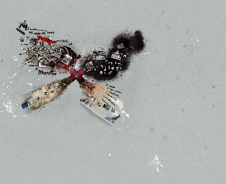
wow that is badass! i think the nav is cool, plus you don’t even need it b/c u can navigate by zooming out and clicking on stuff. totally coolness.
You’re totally right! The site is really cool, very nice graphics and multimedia contents, but the usability it’s quite a mess! It takes a bit to understand how to surf it… But when you know it, it seems quite easy: the developers put also a sort of map top-left to help the users. It was probably the best way to manage it. What do you think?
Usability? Navigation issues?
are you serious?
This is exactly what XGames fans love. music, graphics, shifting frames, easter eggs hidden all over the place.
Done by the masters of shifty flash sites:
http://www.wefail.com
Let’s assume that site is everything an XGames fan would ever want: shitty Flash animation, odd video graphics and hip music.
The problem is that ESPN doesn’t need to attract XGames fans into the XGames. They’re going to watch it because it’s their Olympics. So the challenge is getting mainstream fans to care about action sports, not alienate them.
For that reason, this site is a failure.