Digital advertising and marketing: only the best ideas worldwide, since 2003
Tag archives: infographic
The Internet in 2015
Crazy growth over the next four years. Looks like Asia-Pacific will emerge as the leading area of the world where most activity will occur, although North America will continue on as the leader in TV / video download.
25th Anniversary Of Listserv Infographic
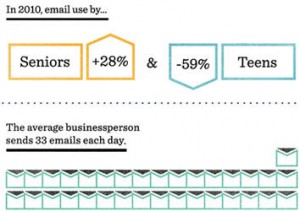
Amazing stats. To join an email list before 1986, users had to wait for someone to painstakingly adjust the code to include them. For Eric Thomas, that was too uncomputerized for a computerized system. So he created Listserv, the first automated email-list-management software. It’s still used to send group emails, though a lot more of them — 30 million emails are sent using Listserv each day, a huge leap from 25 years ago, when electronic mail was just taking off.
The user generated content galaxy [infographic]
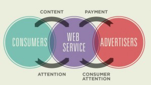
User generated content has become such a huge part of our digital life that we don’t even realize its business impact anymore. Facebook, Youtube and even the old-fashioned Myspace would not be as big as they are without UGC. How much content is produced? This infographic recaps the impressive numbers. And raises an interesting question on how much money Facebook and Youtube are actually making from UGC content they start owning once you upload it.
Science of Social Media Timing
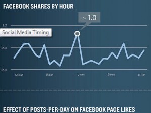
Community managers take note… Ever wondered what is the best time of day to post a tweet or a fb update?? Wonder no more… Utilizing techniques to schedule your social media engagement can maximize the exposure your content will get in social networks. Included are stats for Facebook and Twitter on what days and times are best to maximize the audience size and the possibility that your content will be both found and shared.
60 seconds on the Web [infographic]
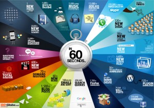
Love this infographic that pictures in a eyeblink what happens on the Web every sixty seconds. 13k iPhone apps are downloaded, 90k tweets are shared, 168 million emails are sent. And this is just the beginning…
Infographic: Apple App Store’s March to 500,000 Apps
The number of apps approved for Apple’s iOS platform has exceeded 500,000 apps according to data collected by app discovery service 148apps, mobile gaming company,Chillingo and San Francisco-based app discovery company, Chomp. Currently, the Apple App Store has 400,000 apps available for download. Nearly 36 percent of all apps are free. Average paid app costs $3.64 per app. It would cost $891,982.24 to download all apps. via
Digital Life : Today and Tomorrow
A very nice infographic video by Mitsue Venture and Neo Labels on digital landscape and digital behaviours from a prospective point of view.
The Ministry in numbers (and illustrations)
As you might have noticed (!? I’m a big fan of Japanese interactive works. I like their visual style, I like the attention to details and I also like the fact that in order to (try to) review them I need to do some research and investigation. The latest website that came under my radar was created back in May by Business Architects for MEXT the Ministry of Education, Culture, Sports, Science and Technology in Japan.
The challenge to understand the project seems to be particularly hard this time… so if a Japanese friend feels like helping it would be great, even if in a way I’m just happy looking at the lovely illustrations and admiring the fresh approach a governmental organ has to online communication.
Popular posts
Tags
adidas advergame advergames advertainment advertising ambient marketing australia belgium best brazil coca-cola email marketing facebook fashion france germany google heineken ikea infographic italy japan marketing mobile content mobile marketing msn nike nokia online ads online advertising online campaign online marketing print advertising rich media samsung sms spain sweden tvc twitter uk video of the day viral marketing volkswagen wieden + kennedy


