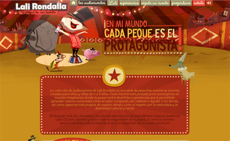
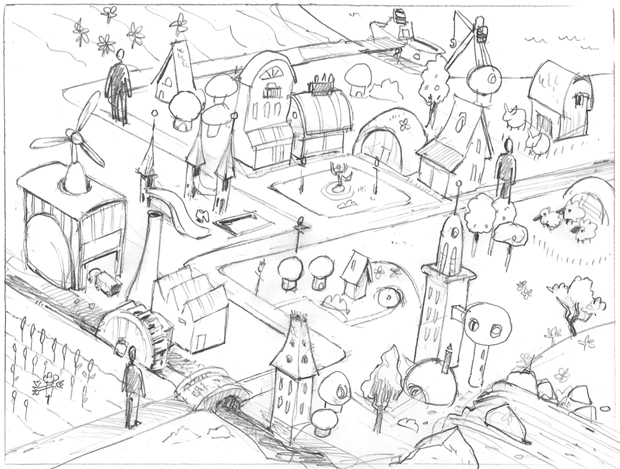
A simple yet powerful idea, Lali Rondalla's audiotales is a series of small sound adventures created for children aged 0 to 8 years. Each story (only in spanish and catala, by the moment) is designed to immerse them (through the little customization of using the child's name) in imaginary worlds where they'll live little fun experiences to help them learn universal values such as sharing knowledge, being brave and helping others, as well as aspects of our own time and respect for nature and cultural and racial diversity.
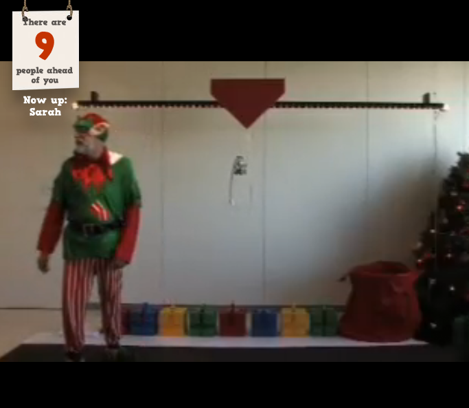
I love agency attempts to create their own digital Christmas experience, and this is a good idea via DTDigital Melbourne. I love this idea.
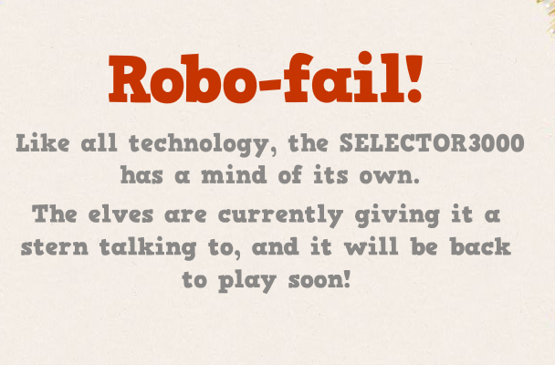
See if you can make it happen... unfortunately I always got to 4 then got a 'fail' message. *****UPDATE****** this campaign is now over. Humphhhh!!
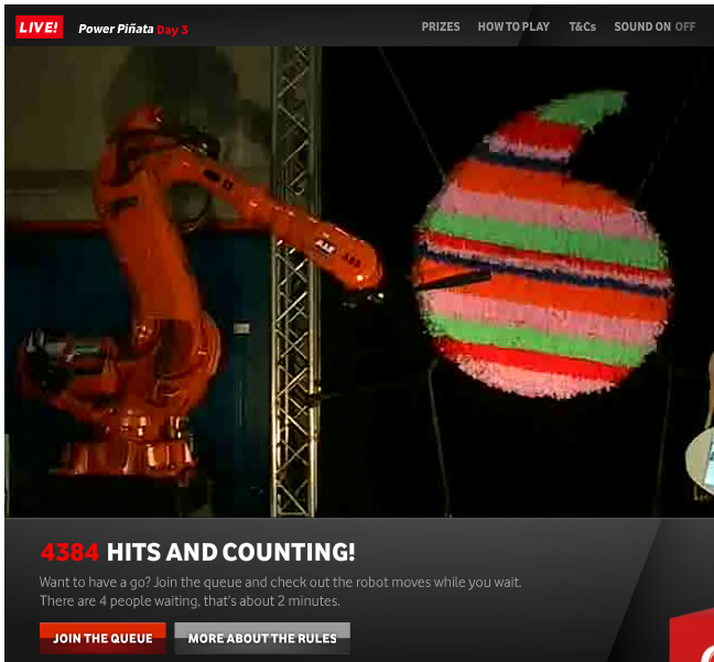
Vodafone Australia have launched a new campaign called Power Pinata. Users 'like' their facebook page and the join a queue to select a 'whack' method from an automated robot holding a baseball bat. When it's your turn you watch live as the robot gives the pinata a smash. Once it's smashed open a flood of prizes will spill out... Loved the idea but the user experience is a bit low. I expected my robot 'smash' to be hard - instead it was a mere tap (if that). Shame as I was expecting a real smash :) Check it out here.
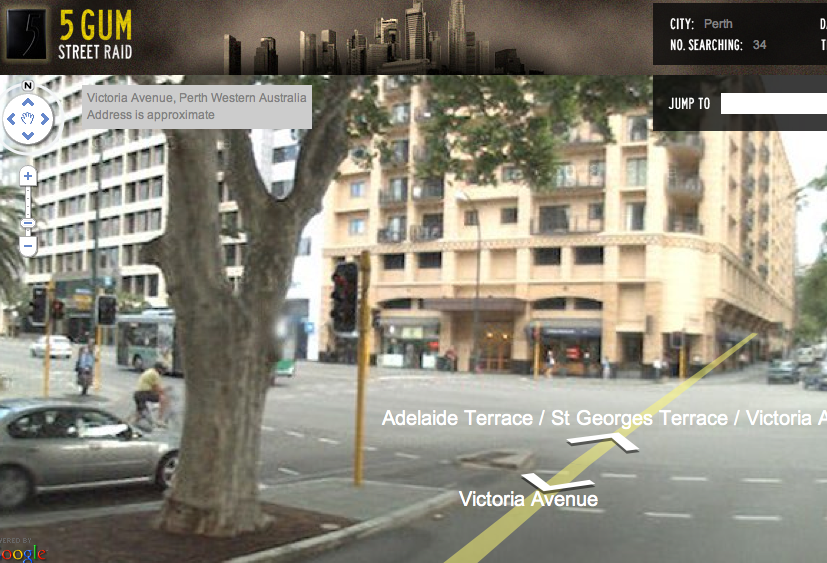
Personally I am a bit over online treasure hunts. Now this site just launched for Wrigley's Limited Edition 5 Gum Tin. It's eerily close to the M&M;'s Canada: Find Red campaign. You decide. Both are fun campaigns.
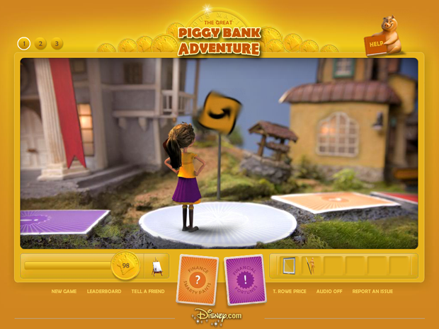
Walt Disney Parks and Resorts Online contacted North Kingdom after they saw "Get the glass" and wanted them to work on a project with them and T.Rowe-Price. They wanted to create a fun game for kids that also teaches them about finance.
Check it out...
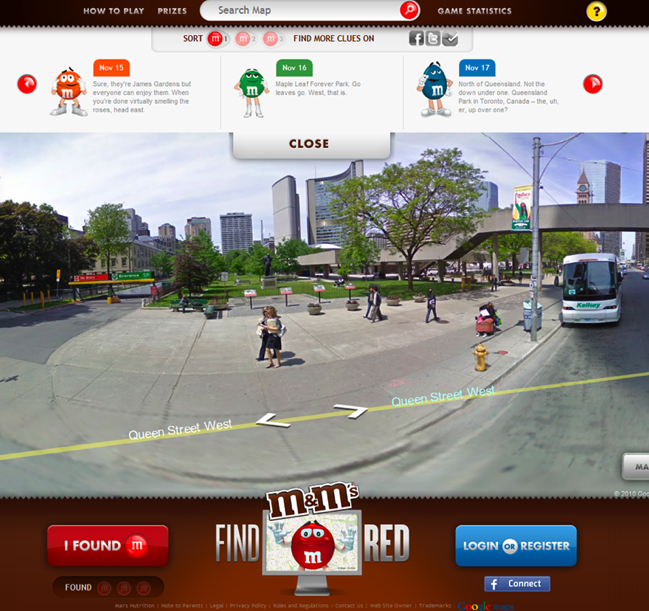
The five colourful M&M;'S spokescandies are looking for their outspoken brother, Red. Canadians will have a chance to win a red smart fortwo coupe by helping with the search in a new online promotion called Find Red created by Proximity Canada.
The search begins on www.findred.ca, where participants can use a version of the Google Maps Street View API to look for three virtual Toronto locations where Red is hidden. To help with the search, the M&M;'s characters will seed clues to Red's whereabouts on various social media channels, including Facebook, where the brand has just launched a new M&M;'s Canada fan page.
By: marka // Permalink // Comment(s): Category(s):New websites
Jewelery store, Michael Hill, has launched an online promotion to find the world's best couple.
The winners get a 22 carat diamond ring. Kim Kardashian is the campaign ambassador. Couples who enter the competition will take part in a series of online challenges. The top six couples will then be adjudicated by a panel of expert judges with the winning couple being flown to Chicago to be presented with the ultimate 22 carat princess cut diamond engagement ring. Check it out here
Thanks Luong Lu. Today, more and more people live alone and according to a late study, loneliness is a bigger health threat than alcoholism, obesity and smoking. What if we could fight it with something so simple like eating, and at the same time, save energy?
Surf wear maker Rip Curl recently teamed up with Timeslice Films for an ambitious project of shooting surfers in “bullet-time“, the effect that many people first saw in The Matrix. Awesome!
By: marka // Permalink // Comment(s):(1) Category(s):New websites
It's a all-digital museum created to showcase all forms of digital art and media.
The vision for the museum is to celebrate digital media and the artists who are embracing and exploring its limitless possibilities. The venue invites visitors to thoroughly explore the interactivity, lack of physical boundaries, and 24/7 availability of the online world. Check it out
By: marka // Permalink // Comment(s):(1) Category(s):New websites
Just came across this from Holler Sydney.
I think it is the very first Facebook 'like' race. Each Horse has their own facebook page and the more followers they get, the faster they get propelled to the finish line.
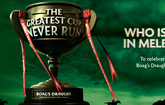
It's a horse race of all the best horses to ever run the Melbourne Cup (Australia's largest horse race). The actual promo is on the bottle caps (you have to collect the winning trifecta).