Digital advertising and marketing: only the best ideas worldwide, since 2003
Tag archives: japan
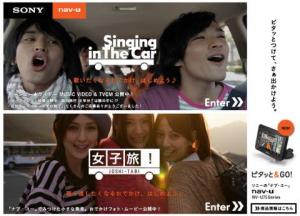
Sony: Singing in the car
From Japan a super crazy and super cool campaign by Sony to promote a new vehicle navigation system. The idea is very simple an it is inspired by something we (almost) all do in the car when we drive with our friends or even by ourselves: we sing.
The campaign is an online audition to pick the best performers singing in the car. Not only the videos get uploaded on Sony’s website, but the best ones also will become part of the TV spot that will go on air as from mid-December.
This is definitely a perfect example of interactive TV content created with consumers help.
Axe in the Dark
In Japan Axe is back with a new weird but cool campaign. Axe in the Dark is an amusing advergame inspired to horror movies full of monsters and with one hero who will (or could) rescue the girl. Everything takes place in a dark cinema hall: the player moves around with the keyboard, trying to avoid to meet the monster and, at the same time, looking for or, better, smelling for the hero who will save her. Make sure to use the hearphones to play.
Once again Axe manages to surprise us. For sure they don’t lack in originality!!
The Honda Eco (and cheesy) Grand Prix
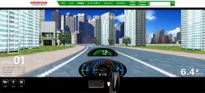
At first sight you would say it is just another racing game. Make sure not to skip the intro, and you will change your mind. Honda Formula E is an advergame launched in Japan to teach people how to drive with an eco-friendly attitude.
In the game you don’t have to use the steering-wheel, but just the brake and accelerator to find the ideal speed to drive in the city, saving gasoline, and therefore saving the planet.
The Ministry in numbers (and illustrations)
As you might have noticed (!? I’m a big fan of Japanese interactive works. I like their visual style, I like the attention to details and I also like the fact that in order to (try to) review them I need to do some research and investigation. The latest website that came under my radar was created back in May by Business Architects for MEXT the Ministry of Education, Culture, Sports, Science and Technology in Japan.
The challenge to understand the project seems to be particularly hard this time… so if a Japanese friend feels like helping it would be great, even if in a way I’m just happy looking at the lovely illustrations and admiring the fresh approach a governmental organ has to online communication.
X-Girl: an example to follow
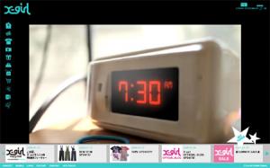
From Japan, a new fashion website I like for the good mix of brand and ecommerce experience. X-girl is teenagers brand with a pretty wide and colorful collection which cannot afford to communicate in a boring way to its consumers and, at the same time, needs to think about ROI.
The Xgirl website first of all features a great interface, which really shows you the effort they put in making the experience entertaining, interesting and last but not least usable. Even if everything is in Flash you never feel lost in the navigation which is, weird but true, quite uncommon in ecommerce enabled Flash websites.
The coolest University website ever
I bet you have never seen a cool University website. I don’t mean usable, useful and interesting, I really mean “cool”. Well, in Japan Zokei University has recently launched a website and a recruitment campaign that are terribly cool and engaging.
The website looks exactly like a 8-bit videogame, and I can’t imagine a better way to drive recruitment for an art and design school. If the website is so fresh and “brave”, you can definitely expect their approach to education to be as fresh and open.
The Uniqlo calendar
Another interesting online project from Uniqlo. After “the clock” and “the map“, it’s time for “the calendar”.
The website at the moment is pretty basic: landscapes across Japan are featured with tilt-shift style photos. If you click on the photo it becomes a mosaic, and you can discover an Uniqlo item that matches the color of the tile. As usual (at least for the Japanese brand) e-commerce is then just one click away.
Nissin Ufo Noodles
As usual, I don’t understand a word, but I love the illustrations on the Nissin Ufo Noodles website launched Japan.
It’s also interesting to see such an unusual artistic approach to food marketing. No fancy perfect pictures of the food, but rather a colorful chaotic browsing through illustrations and animations.
Uniqlo Polo Now
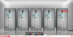
From Japan, a new interesting project by Uniqlo. How to make a polo collection cool just playing with some good photos and a great sound design. And e-commerce store, as usual, is just one click away.
The dancing t-shirts
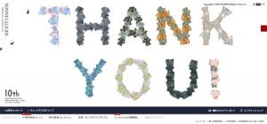
An infinite number of animated t-shirts populates the summer collection of Japanese fashion brand Sunny Clouds. The website is pretty basic but also quite fresh in presenting the product and driving immediate sales.
The animations with the t-shirt definitely buy the products some attention, and even the product catalogue shots become interesting in a context that communicates a feeling of joy and makes you feel Spring is almost here.
Popular posts
Tags
adidas advergame advergames advertainment advertising ambient marketing australia belgium best brazil coca-cola email marketing facebook fashion france germany google heineken ikea infographic italy japan marketing mobile content mobile marketing msn nike nokia online ads online advertising online campaign online marketing print advertising rich media samsung sms spain sweden tvc twitter uk video of the day viral marketing volkswagen wieden + kennedy
